PCA Articles
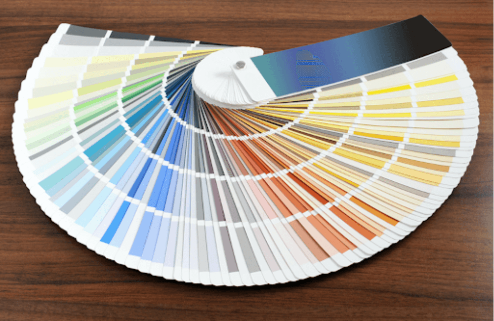
PPG Webinar: Tips, Tools, and Trends for Interior Design
Choosing a paint color is a stressful activity for most clients. The process can take quite a bit of time and even delay the job, creating unneeded tension between you and your client.
In collaboration with PCA, PPG design and color experts Michelle Snyder and Jennifer Norris conducted a webinar to educate viewers on the tips, tools, and trends when it comes to interior design. Having been in the industry for quite some time, the two are skilled in providing quality color design services and have acquired vast knowledge of paint products.
Tips of the Trade – Fun Ways To Introduce Color Into A Home
Michelle and Jennifer collaborated to teach viewers how to earn recurring business by subtly incorporating color into a project. The starting point, explained by the two women, is by finding inspiration. Whether it be inspiration from artwork or even something found on Pinterest, the color experts expressed that there are many ways to incorporate color into your home that will give it a good flow.
Hallways
Painting one hallway wall a darker color than the other might create the appearance that the hall is wider.
Create an Office
Since the chaos of the pandemic started, plenty of people were left trying to find space for an office area. By taking down a closet door and painting the back wall, you can add a vibrant splash of color to your space while transforming it into an at-home office.
Experiment with Steps
Another fantastic technique to add color to a space is to paint the stairs. As a result, there is no need for carpeted stairs or a runner that will eventually need to be replaced and is a costly rehab.
Contrast and Camouflage
To minimize unattractive paint, paint the trim the same color as the wall, and add a higher shine to emphasize it even more.
“This tip is great when you place one single color in a dining room, library, or office. It adds such a nice, classy, and sophisticated touch,” said Michelle.
Powder Rooms
Experimenting with colors like navy, black, or dark gray is a great way to make a statement in your bathroom and have fun. Another excellent approach to experiment and create a sleek luminous finish is by using metallic products.
Although gold and silver metallics are currently the most fashionable, Jennifer explained that they are timeless and never truly go out of style.
Small Rooms
Small rooms don’t necessarily need to be lighter in color. A small room’s comfort can be enhanced by being painted in a rich, warm color.
Color Blocking
Color blocking is one of the more current obsessions in interior design. It can add movement, interest, and contrast. By incorporating two or more complementary colors onto exteriors, you can increase architectural interest.
How PPG Approaches Color Forecasting
The result of months of research and client data collection is PPG’s annual forecasting workshop, which offers a genuinely global, validated color direction palette. PPG maintained and improved the exclusivity and collaborative character of their process despite having a wholly virtual event.
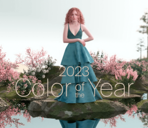
“Jennifer and I were honored to be a part of the selection process on the architectural side for the 2023 color of the year,” said Michelle.
PPG’s 2023 Overarching Theme – Reflections
“Reflections” is such a fantastic, versatile word to use when discussing trends. Three “stories” make up this theme, which PPG created to identify with people and provide inspiration with complementary color schemes for varied styles. To see which theme suits you the best, go take PPG’s quiz!
Serenity
This story is described as a design theme that reflects on our relationship with ourselves and our need for sanctuary and calm. It has a very calming effect thanks to the pastel hues, watery tones, and warm neutrals in this elegant palette.
Origin
This design topic explains how our interactions with the environment have changed over time. This harmonious color scheme exudes a very earthy and vibrant vibe thanks to the natural and earthy feel.
Duality
Celebrating the dynamics of our relationships with each other and how we show ourselves in the world is Duality. This extroverted palette is made up of bright colors, pure pastels, and imposing neutrals
PPG’s Forecasted Color of the Year
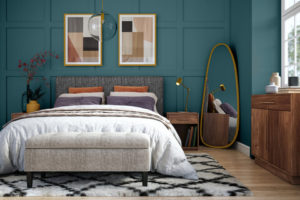
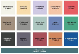
The forecasted palette would not be complete without the color of the year. PPG’s forecasted color of the year is a beautiful robust and refined green blue tone, Vining Ivy. This shade is enchanting, rejuvenating, and versatile. After weeks of discussion and debate, PPG’s color experts selected this shade for three key reasons:
- The evidence of this hue in PPG’s research as a trending color
- Its connection to PPG’s overarching theme of reflection
- Its relation to each of the three design themes- serenity, origin, and duality.
Vining Ivy’s inclusion in each design theme enhances their meaning even further. This color is described as enchanting, rejuvenating, and versatile.
More Interior Tips and Trends from PPG’s Color Experts
From sharing tips about how to incorporate color into projects, to sharing trending colors and tools to get the job done, Michelle and Jennifer hope that painters can become the trusted expert their clients need by helping them feel confident in their color and design choices.
To get even more exclusive insight from PPG’s color experts, such as information on the sheen factor, feature walls, exterior tips, PPG’s stain of the year, PPG’s favorite products, and more, watch the full webinar on PCA Overdrive.
Who is PPG?
Captain John B. Ford and John Pitcairn founded PPG in 1883 in Pittsburgh, Pennsylvania. PPG was the country’s first commercially successful plate glass company when it originated. The business, which went under the name Pittsburgh Plate Glass Co., prioritized innovation and quality.
Today, more than 135 years after its creation, PPG continues to uphold the principles of Ford and Pitcairn by providing customers with distinctive technology, services, and other solutions in a variety of markets and geographical regions.